Friday, 28 August 2015

FILIPINO DESIGNS

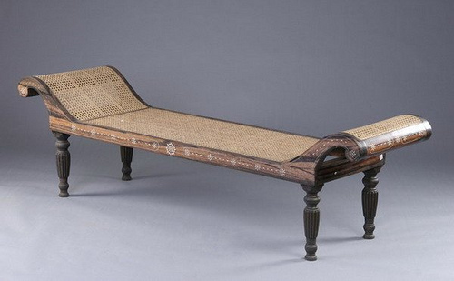
Interior design in the Philippines have been long influenced by the colonization of Spaniards and also of the Americans. Filipino furniture designs and Filipino inspired interiors may not be as popular but it does truly represent how rich and unique it can be. During the western occupations in the islands, influences from Europe and Americas can still be seen in different places in the country. In the early 1500s, settlement of the Spanish had then been the start of change in the native’s lives. Bringing in the western culture, natives have adopted and made their own versions of furniture using the country’s resources like dark timber finish and dried up plant fibres, bamboo and much more.


The interiors wall finishes is usually just a light natural finish, could be beige, or a warmer white, to make the dark wood colour of the furniture pop out in the space and also to have that minimal look as with the intricate designs might clutter the interior.


disclaimer: I do not own the images
COPPER & ROSE GOLD

COPPER & ROSEGOLD TREND


Copper is a metal alloy that has been around for more than 10 000 years and had been used as jewelry, currency, tools, and decorative objects whilst Rose gold is gold with a pinkish hue that became fashionable in the 19th century. Rose gold is pretty much gold that is mixed with copper.


When it comes to making your home design unique, copper is more popular to be used as fixtures and fittings in bathrooms and kitchens. Rose gold however takes priority in light fixtures such as lamps, pendant lights and other accessories like wall ornaments that you might find inside the home.


Using a more matte or rustic tone of the copper tends to have the timeless, a more antique warm look in the space whereas the shiny, sleek rose gold gives it the smooth and modern twist in the space. Both of these inside a space would be contrasting it may also unite and balance the interiors elements as it will give more texture and taste in the space. The warmth that these hues give off is truly welcoming and it is no wonder that they are both trending in terms of interior design and fashion.


disclaimer: I do not own the images

ART IN YOUR HOME

Gone are the days of cut flowers and cactuses because there is a new fad at the moment and it is taking everyone by a storm. We were always told to put a living plant inside our interiors as a finishing touch and to represent life in the space but this new comer is not your typical living plant inside a space.


Decorating a room with succulents sure seem pretty easy enough to make your interior livelier. A lot may argue that having living plants in their homes are having troubles keeping them alive or even to maintain its healthy and fresh state. Succulents are low maintenance home accessories/decor and they are pretty versatile too, even outdoor gardens and front patios can be decorated by purely just succulents. Succulents can live with just three things; sun, water and a little bit of fertilizer. 


These beautiful little living things can come in different shapes, sizes and even colours. It is almost too easy to find which kind of succulents would go great with your featured painting, table, books or whatever it is that you would pair up with them. Their organic shape and colour is almost as good of a contrast in junction with today’s modern, crisp and clean lines of furniture and elements of a modern home.


disclaimer: I do not own the images

WALLPAPER TREND

Wallpaper is what is use to decorate or cover interior walls such as the ones in our homes, offices, café and much more. It is commonly known that wallpapers are often designed with repeating, patterns.

The use of wall treatments such as wallpapers dates back as far as the 1700s. Many techniques are used to create the patterns and design of wallpapers, like hand painting, woodblock printing, stencilling and machine printing.

Though wallpapers had the peak of its popularity during the early centuries, there are disadvantages in applying wallpaper finish in each interiors. Wallpapers are applied on to the wall with the use of adhesive, which could mean high moisture rooms are not the most suitable spaces to put it to, the moisture could damage the paper, that would lead to peeling, rippling and damaging of the finish you desired. Applying wallpapers with intricate designs must also be well taken care of, design and patterns must match and the seam not visible for a continuous and flowing design in the space.

 Despite of all the cons of choosing wallpaper for interior finishes, it is now back in the game and are even more popular than ever. With the consumer’s ever growing personal taste and preferences when it comes to their homes, wallpapers are the best option whether it is a bold, traditional, graphic or simple space they’re looking for, there are many wallpaper designs to choose from.

Patterns and colours have a huge role in the wallpaper industry. Certain shapes, patterns and hues creates different feels and aura inside the space. May also play trick in our eyes, making a smaller room look bigger with large scale designs paired light cheerful colours.


To know more about which wallpapers would best suit you and your interior, read more here.

For more wallpaper trends, read here.

disclaimer: I do not own the pictures

Wednesday, 19 August 2015

PANTONE: Personal Taste and Trend Development


At the start of the course last year, we interior design students were introduced to ‘Pantone’, a colour matching system, using the pantone numbering system for identifying colours.

Here is the pantone colour that time:

I looked up the history of Pantone and I found out how the Pantone Inc. started. Pantone developed the first colour matching system in 1963, which consisted of a large number of small cardboard sheets, printed on one side, accompanied by other relevant colour swatches that are bound into a small ‘fan-deck’ and was then instantly coined as the Pantone matching system, or PMS. The aim for this project was to help designers to “colour match” specific colours when a design enters production. This system was then widely adopted by designers and still used up until today in different industries to specify colour.


Coming back to the present time, Pantone releases colour of the year annually to set the trend and colour and to inform designers of what the colour symbolises. Last year’s Radiant Orchid represented captivating, magical, enigmatic purple. This colour is the result of blending fuchsia, purple and pink undertones.
Moving on the next colour trend, it was Marsala, an earthy wine red that was hailed as the colour of the year last December.


This Hue has now become as the base foundation of spring/summer palette. “Sensual and bold, delicious Marsala is daringly inviting tone that nurtures; exuding confidence and stability while feeding the body mind and soul” Read more here.

 This colour goes great with different shades of blue, from turquoise to teal and also shades of pink.


To see more of this pantone colour in action, click here.

disclaimer: i do not own the pictures